Just Plane Fun
A Little Mood Lighting
Since we will soon be rendering to see how our textures look, we ought to go ahead and set up our lighting now. I chose to light the scene with a spot lamp to simulate a desk lamp, with objects inside and outside of the pool of light. If you don't have the default lamp in your Blender start up file, add a spot lamp now (Add>Lamp>Spot). If you have the default lamp, turn it into a spot lamp as follows:
- Select the lamp
- Click the Shading button and then the Lamps button
- Near the preview window, click "Spot"
- Set the Dist. (Distance) to 65
- Set the Energy to 3
- Set the SpotSi to 77 - this sets the angle of the spot cone
- Set the SpotBl to .40 - this sets the amount of blur at the edge of the spot.
- Click on the color bar and give the light a slightly blue tint (If you want to do exactly as I have done, click on the color bar and enter E0F9FF in the box labeled Hex).
Now, in side view, move your spotlight up until the bottom of the cone is slightly above your plane, and re-center the cone on the plane. This is the primary light source for our scene.
In order to make any render in Blender look good, you need at least two sources of lighting. Our second source will be a hemi lamp. Add one (Add>Lamp>Hemi).
The hemi lamp is an omnidirectional lamp the adds light within the shadowed areas. The hemi acts much like a reflector or 'fill flash' used by photographers and cinematographers. To match the settings in my render, simply set the energy to 0.5. Note that too much hemispherical light will wash out the shadows and make them look unrealistic. Too little and the shadows become black holes.
From the front (Numpad 1), your model should look something like this at this point (you may need to scale and move the plane around to match):

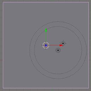
And from the top (Numpad 7), like this:


No comments:
Post a Comment